Handshake
Handshake
WEB
Interface
Ux Designer & Researcher
Role
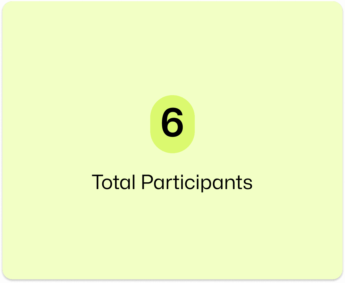
5 (2 designers & 3 researchers)
Team
5 (2 designers &
3 researchers)
Team
Sep 2022 - Dec 2022
Duration
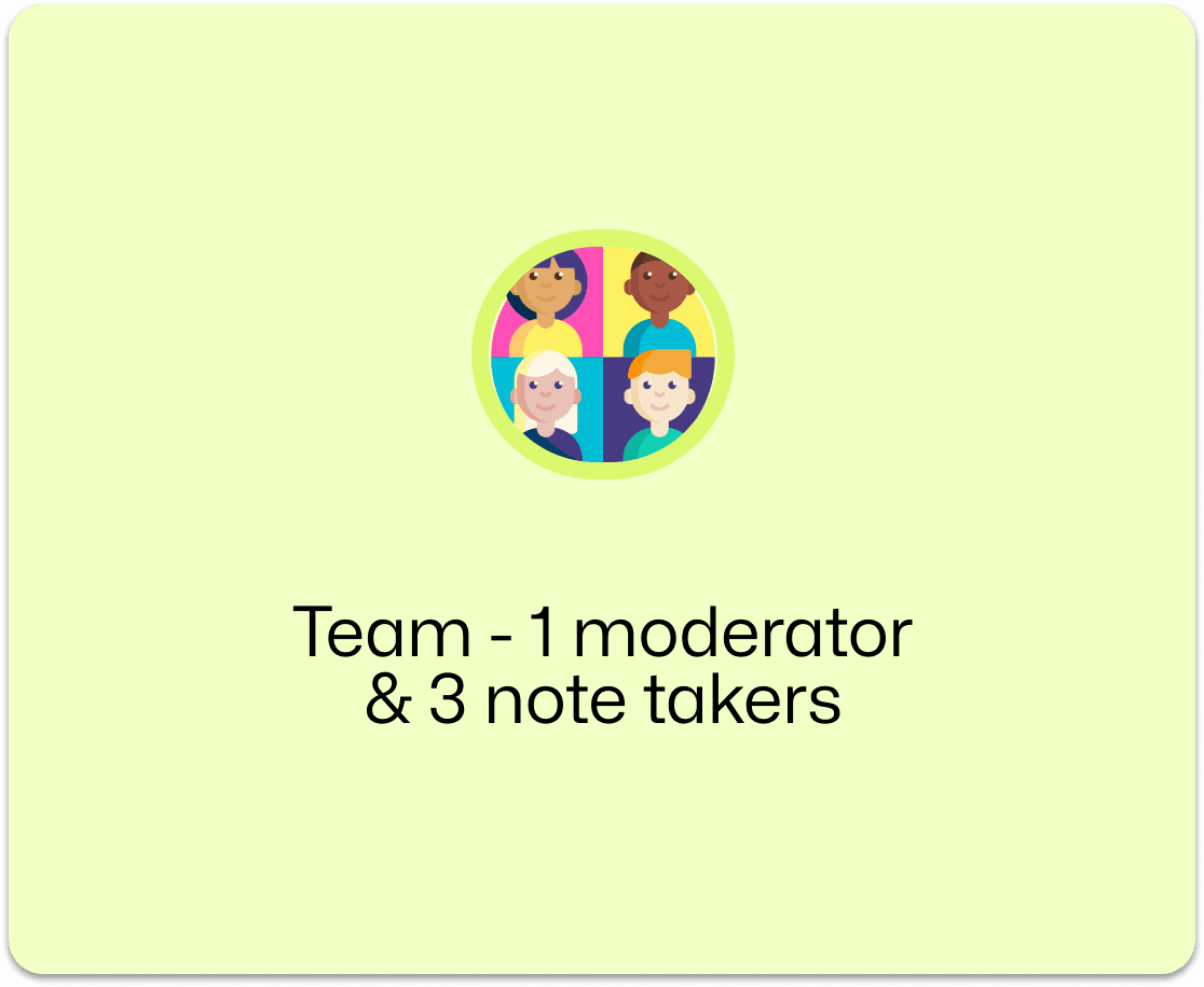
5 (2 UXD & 3 UXR)
Team
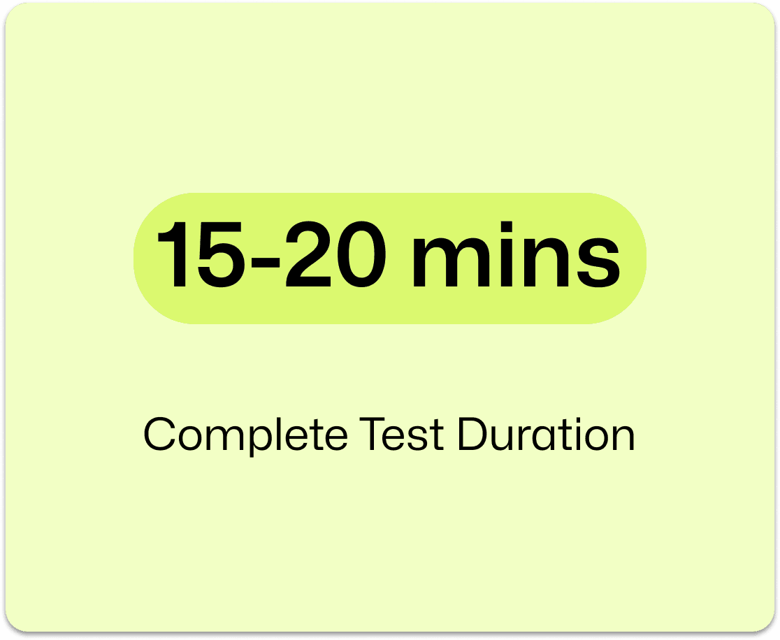
Sep'22 - Dec'22
Duration
Ux Designer & Researcher
Role
5 (2 UXD & 3 UXR)
Team
Learnings
Learnings
Learnings
Learnings
User Feedback is Gold
User Feedback is Gold
User Feedback is Gold
Small Fixes, Big Wins
Small Fixes, Big Wins
Small Fixes, Big Wins
Design for Clarity First
Design for Clarity First
Design for Clarity First
Handshake: The Job Board for Students… or Is It?
Handshake: The Job Board for Students… or Is It?
Handshake was hyped as the go-to for student jobs. So we put it to the test.
This is the story of how we explored its UX - and made it better.
Handshake was hyped as the go-to for student jobs. So we put it to the test.
This is the story of how we explored its UX - and made it better.
!! Heuristic Evaluation Violations !!
!! Heuristic Evaluation Violations !!
Visibility of System Status

Help Users Recognize and Recover from Errors

Flexibility and Efficiency of Use
Flexibility and Efficiency of Use

Visibility of System Status
Help Users Recognize and Recover from Errors
Flexibility and Efficiency of Use
Flexibility and Efficiency of Use
Visibility of System Status
Help Users Recognize and Recover from Errors
Flexibility and Efficiency of Use
Flexibility and Efficiency of Use
Visibility of System Status
Help Users Recognize and Recover from Errors
Flexibility and Efficiency of Use
Flexibility and Efficiency of Use
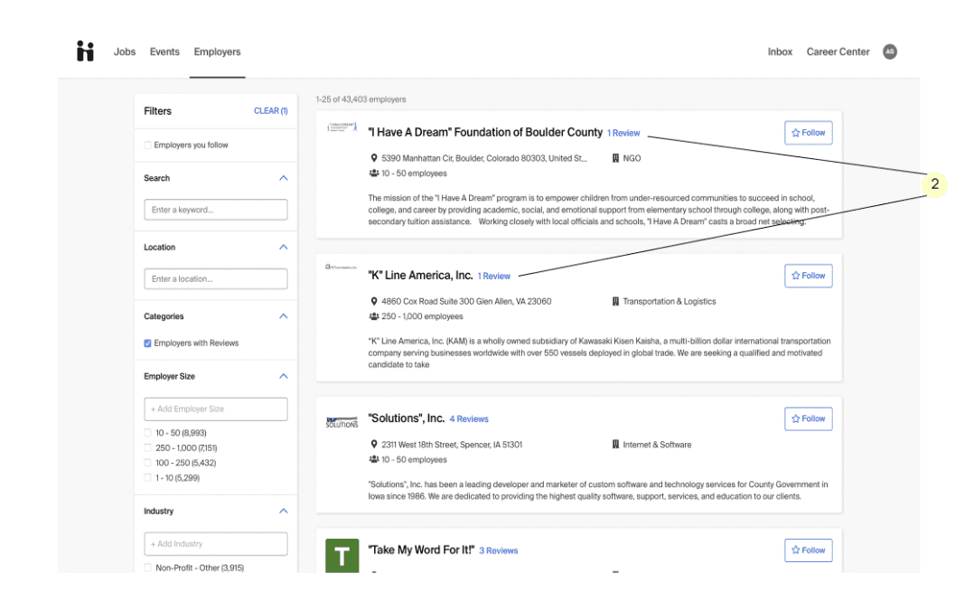
What's Out There?
What's Out There?
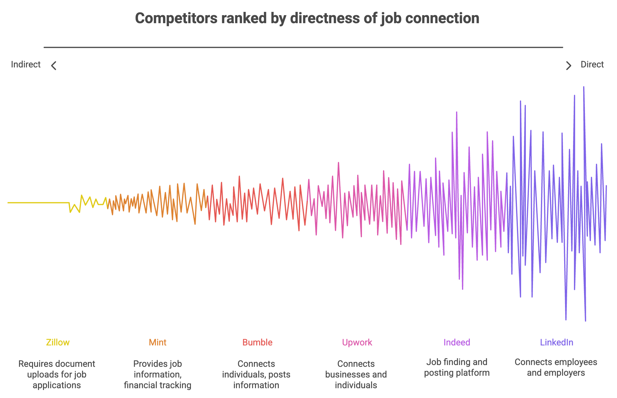
Opportunities for Improvement
Opportunities for Improvement

Test Recruitment
Test Recruitment
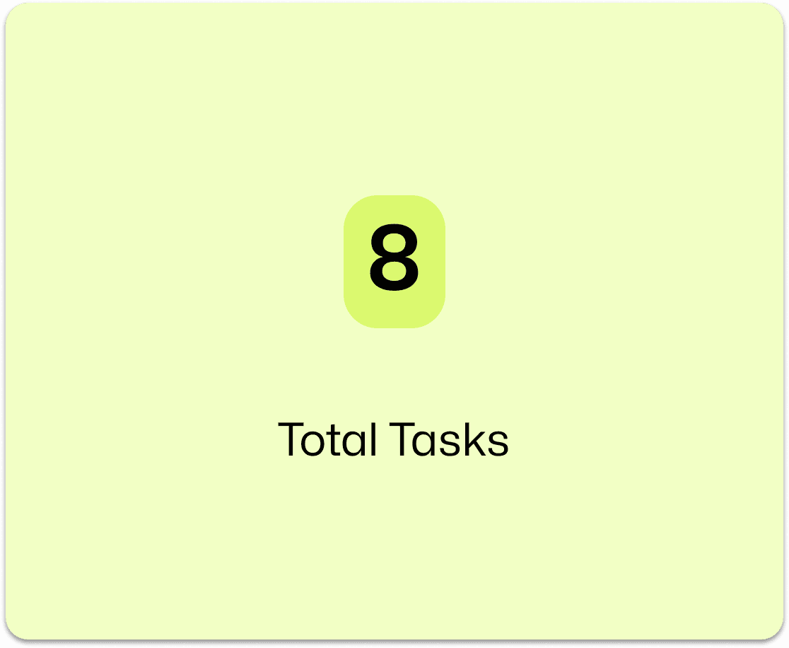
10 students. 3 tasks. 20 minutes each. Simple setup, major insights.
10 students. 3 tasks. 20 minutes each. Simple setup, major insights.
Top 3 Findings & Recommendations
Top 3 Findings & Recommendations
Completed Without Help
Completed Without Help
Completed Without Help
Completed Without Help
Average Time Taken
Average Time Taken
Average Time Taken
Average Time Taken
33%
33%
33%
33%
1:39
1:39
1:39
1:39
Reported Task as Fair
Reported Task as Fair
Reported Task as Fair
Reported Task as Fair
50%
50%
50%
50%
"Resume upload section was difficult to find."
"Resume upload section was difficult to find."
"Resume upload section was difficult to find."
"Resume upload section was difficult to find."
Create dedicated resume section with autofill option for easier navigation .
Create dedicated resume section with autofill option for easier navigation .
Create dedicated resume section with autofill option for easier navigation .
Create dedicated resume section with autofill option for easier navigation .

01
01
01
01
Completed Without Help
Completed Without Help
Completed Without Help
Completed Without Help
Average Time Taken
Average Time Taken
Average Time Taken
Average Time Taken
50%
50%
50%
50%
5:11
5:11
5:11
5:11
Reported Task as Fair
Reported Task as Fair
Reported Task as Fair
Reported Task as Fair
50%
50%
50%
50%
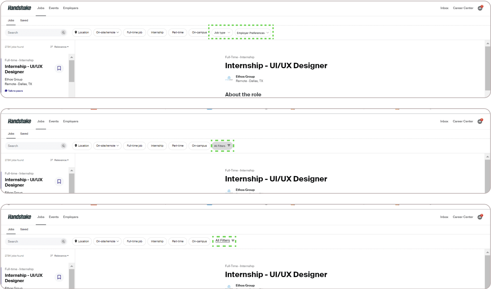
"The 'All Filters' tab was difficult to find."
"The 'All Filters' tab was difficult to find."
"The 'All Filters' tab was difficult to find."
"The 'All Filters' tab was difficult to find."
Highlighted "ALL FILTERS" tab and placed other essential tabs for improved visibility.
Highlighted "ALL FILTERS" tab and placed other essential tabs for improved visibility.
Highlighted "ALL FILTERS" tab and placed other essential tabs for improved visibility.
Highlighted "ALL FILTERS" tab and placed other essential tabs for improved visibility.
02
02
02
02
Completed Without Help
Completed Without Help
Completed Without Help
Completed Without Help
Average Time Taken
Average Time Taken
Average Time Taken
Average Time Taken
50%
50%
50%
50%
5:01
5:01
5:01
5:01
Reported Task as Fair
Reported Task as Fair
Reported Task as Fair
Reported Task as Fair
50%
50%
50%
50%
"Differentiating between read and unread messages was difficult."
"Differentiating between read and unread messages was difficult."
"Differentiating between read and unread messages was difficult."
"Differentiating between read and unread messages was difficult."
Increased contrast between read /unread messages. Added unread message counts, and distinct demarcation of unread messages.
Increased contrast between read /unread messages. Added unread message counts, and distinct demarcation of unread messages.
Increased contrast between read /unread messages. Added unread message counts, and distinct demarcation of unread messages.
Increased contrast between read /unread messages. Added unread message counts, and distinct demarcation of unread messages.

03
03
03
03
SUS Analysis
SUS Analysis
SUS Analysis
SUS Analysis

Insights & Recommendations
Insights & Recommendations
Insight 1
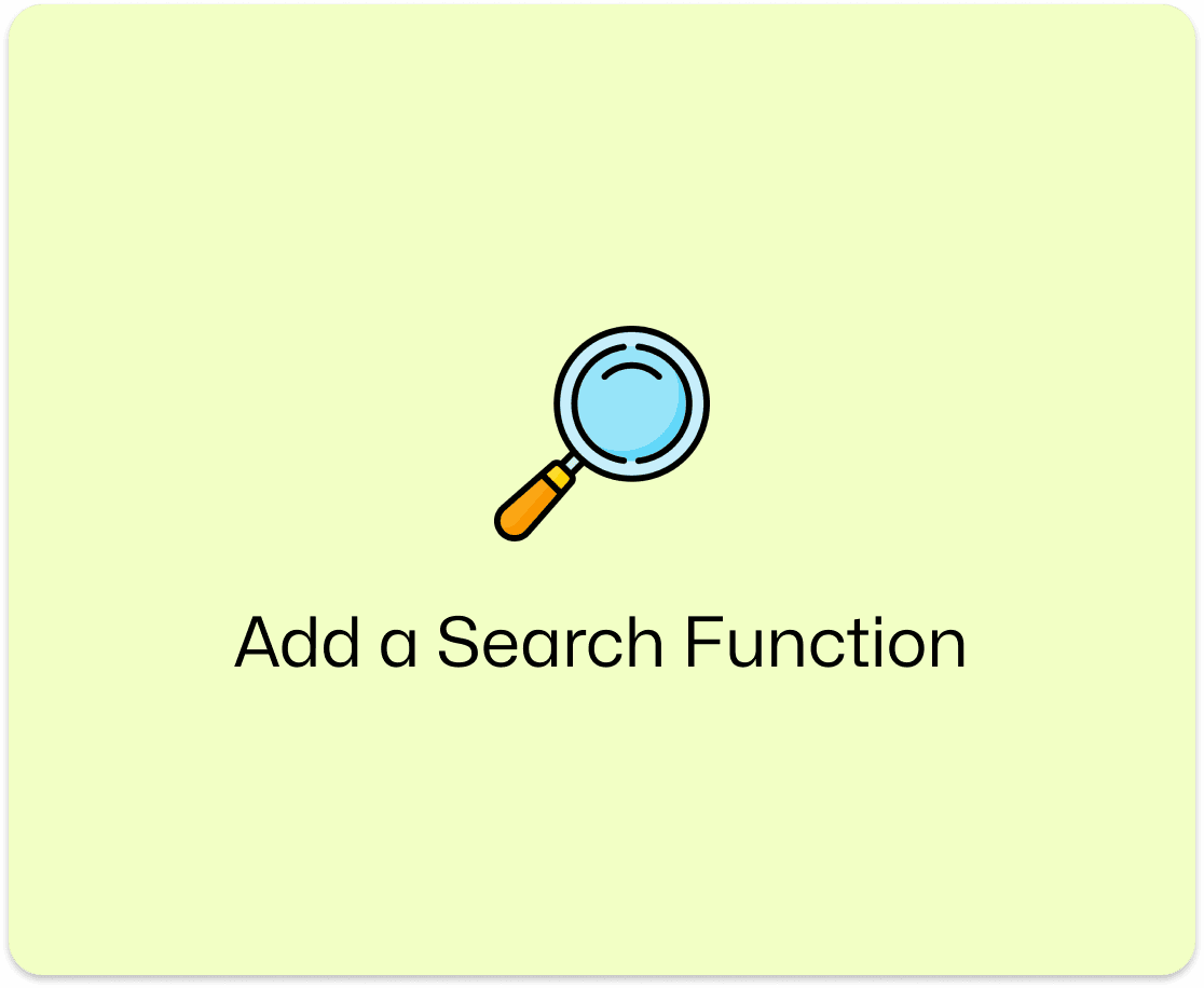
No Search Function (83% participants)
Insight 1
No Search Function (83% participants)
Recommendation 1
Add a prominent search bar in the navigation for faster job discovery.
Recommendation 1
Add a prominent search bar in the navigation for faster job discovery.
Insight 2
No Completion Feedback (impairs the system status visibility.)
Insight 2
No Completion Feedback (impairs the system status visibility.)
Recommendation 2
Use subtle progress indicators or toasts to confirm task success.
Recommendation 2
Use subtle progress indicators or toasts to confirm task success.
Insight 3
Overloaded Home Screen
Insight 3
Overloaded Home Screen
Recommendation 3
Simplify content layout to reduce cognitive load and improve scanning.
Recommendation 3
Simplify content layout to reduce cognitive load and improve scanning.
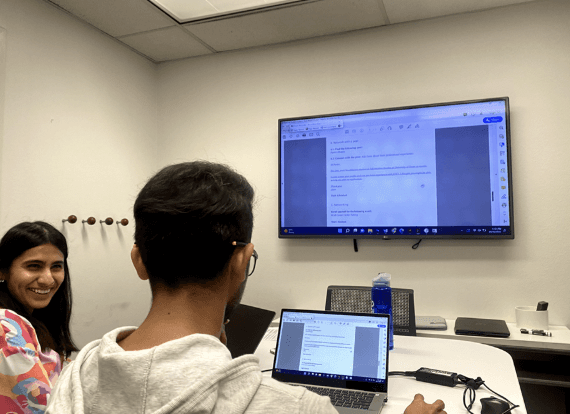
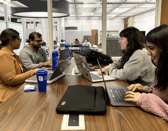
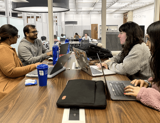
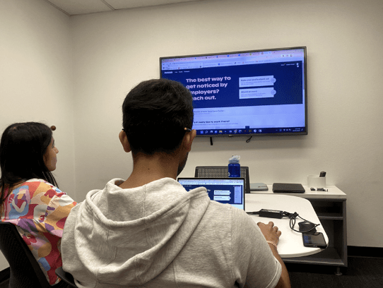
Snaps During our Experiment
Snaps During our Experiment